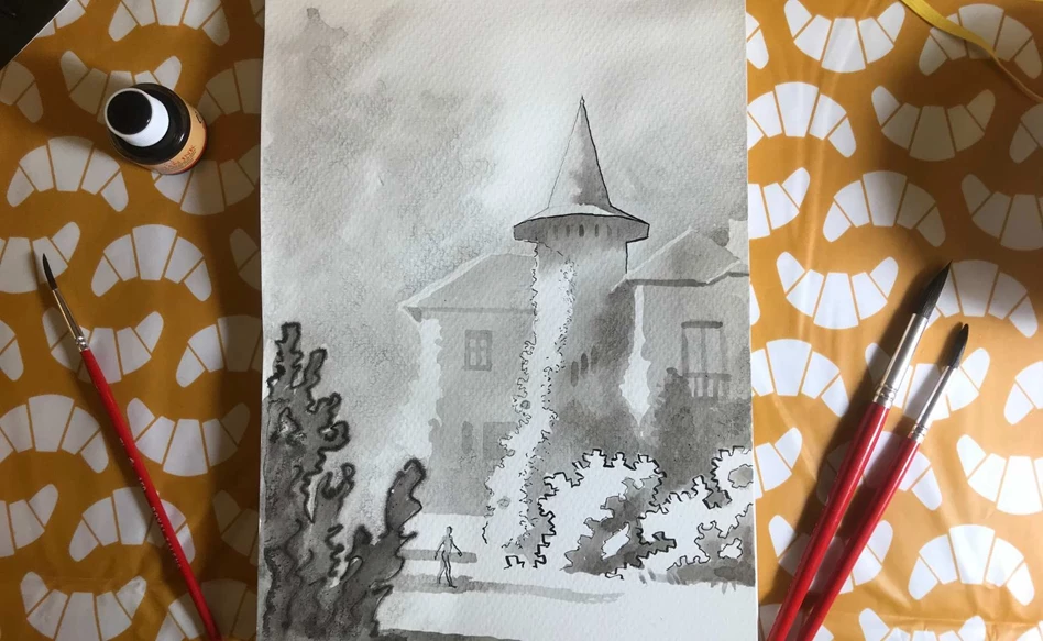
Castle garden in ink
The weather is drizzly but despite the rain, sunshine can still come out of your pen. That's why we're going in depth with ink. With a few simple strokes and pen techniques, a great sense of space can be created.
What you need
- Talens Indian ink
- Pencil, grade: hard
- Watercolour paper, for example from Talens Art Creation
- Some water colour brushes
- Dip pen
- Some trays for ink and water
Tips
- Do not dip your dip pen or brush directly into the inkwell unless you are using undiluted ink. This prevents the ink from being diluted by water on your brush. When you dilute the ink, pour some from the jar into a small container like a thimble.
- If you use different degrees of diluted ink, keep a few ink trays handy and use a different tray for each degree of dilution. Then you don't have to keep diluting over and over again.
- Keep a clean brush and a bowl with only water separate. You can use these to wet your paper.
- After use, clean your brushes and dip pen thoroughly so that they remain usable for longer.
- Before you start, read through all of the steps.
Step 1
Using a hard pencil, I sketch a light outline of the subject on Talens Art Creation watercolour paper. I'm thinking about how to make an attractive composition while doing so.

Step 2
I use Indian ink to create my focal point. I use a thicker line in the shade and a thinner one in the light. My light comes from the left. On the boundary of light and dark, I show the texture of the leaves.

Step 3
In front of my castle is a big bush. To make it stand out, I use much thicker lines than for the tower.

Step 4
In the foreground is another bush. For this, I use another trick to represent spaciousness: focus. Your eye can only focus on one area at a time and everything around it becomes blurred. That's why I first wet the paper and then draw the bush using a fully loaded pen. The wet paper spreads the ink and makes the lines less sharp.

Step 5
I also keep the background vague. With a clean brush, I wet the surroundings but leave the areas on which I want to work more accurately. I drip diluted ink from my brush in the wet areas to represent a faint forest edge.

Step 6
I apply a layer of diluted ink over the furthest element of the building, leaving the light untouched.

Step 7
After drying, I do the rest of the building. For the tower, I first wet the roof and drip ink on it from the shadows. Where it is darker, such as behind the bushes, I use more ink. On the ground, I make two stripes with my brush to indicate shadows of elements that are out of the viewer's sight.

Step 8
I also apply a layer over the front bushes. The bush at the front gets a shadow on the ground that is darker than the shadows in the background.

Step 9
Now it's time for details. On both dry and wet on wet (ink on wet paper) sections I apply a few more strokes to indicate windows and deeper shadows.

Step 10
Finally, I paint a few windows and add a walking figure. Just because I felt like it. Because the most important thing is to have fun!

Other step-by-step plans with ink

Castle garden in ink
Step-by-step
White ink flowers on black paper
Step-by-step