Tonal Greys
While greys may seem a bit boring, once you experience their qualities, they become indispensable to your colour palette. Grey is neither black nor white. It darkens with black and brightens with white. This might seem confusing, but this combination allows these grey shades to perfectly neutralise various colours.
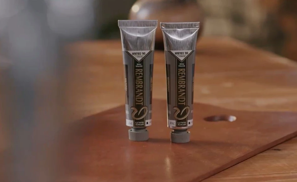
In the video below, we show you our two favourite, most versatile grey shades: Cold Grey (717) and Warm Grey (718). To demonstrate their undertones and effects when mixed, each shade is mixed with a red, yellow and blue shade. This might help you select the right colour for your next artwork.
How to use grey shades
Grey shades are perfect for mixing and toning down different oil colours. They help neutralise and regulate colour temperatures. Any colour normally sits on the spectrum we know as the rainbow. Since greys fall outside of this spectrum, they allow you to pull a colour towards a calmer, more balanced place.
Cold Grey (717) tones the brightness of a colour down to a neutral, cold shade. Warm Grey (718) does the opposite and pulls it towards a neutral, warm shade. You can also think of grey as a base from which you work. It can be added to any possible colour.
Assortment
The following shades of grey were used in this video:
To demonstrate their effects, both shades were mixed with 321 Permanent Madder Light, 254 Permanent Lemon Yellow and 517 King’s Blue.
Other Oil Colour Blogs

Transparent Oxides
Oil Colour
Whites
Oil colour
Tonal Greys
Oil colour
Cadmiums and alternatives
Oil colour
Red shades
Oil colour
Blue shades
Oil colour
Green shades
Oil colour