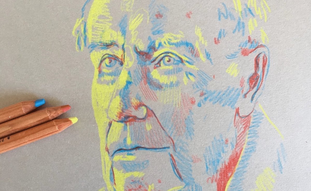
Portrait in primary colours - Royal Talens

What you need

  • Bruynzeel Design coloured pencils in red, lemon yellow and cyan blue
  • Rembrandt toned paper in Industrial Grey

We used grey-toned paper to provide a contrast between the paper and the lightest colour. This would not work as well on plain white paper.

Step 1

Start by using the lightest colour, so the yellow shade, for the lightest portions of your portrait.

Step 2

Use blue to define the facial features. The blue shade can be used to add some contours and contrast to the face.

Step 3

Keep building up your portrait in these two shades. Play with the pressure you apply and the build-up of colour to create more contrast.

Step 4

With the darkest colour, the red shade, you can add some deeper shadows to the bottom of the chin, the nose and eyes and anywhere else you feel needs shadows.

Step 5

Take a picture of your finished portrait and convert it to greyscale. See how it looks like a perfect black and white portrait? This shows this is a portrait in colour, but also in light and dark!

Which version do you like best? The coloured or the black and white one? Try this technique out for yourself and see how fun it is to experiment with primary colours!