


Related blogs

Paint Like the Ocean
Discover how acrylic paint can capture the movement, depth, and atmosphere of water through colour, layering, and fluid techniques inspired...
Sketch your world with Amsterdam Acrylics
From quiet coffee moments to busy streets, sketching helps you see more. In this blog, Jeff Olson shares how to...
The architecture of intimacy: a bridge between acrylics and oils
By Ale Casanova In Eclosion, Ale Casanova explores the dialogue between acrylics and oils on a large scale. By combining the...
Get started with acrylic paint
You don’t need much to get started with acrylic paint. We have listed the most important supplies for you.
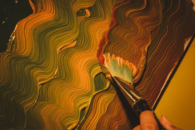
Layer, combine, experiment
April is a call to disrupt routine. As light returns and energy shifts, it becomes easier to invite risk back...
Women in art working with acrylics
Acrylic paint has been a transformative medium in modern art, giving artists the freedom to experiment and express themselves. For...
A gentler pace, a quieter palette
For February’s chapter in our yearlong celebration of Amsterdam Acrylics, written by Jeff Olson, we turn our attention to Soft...
The evolution of acrylic paint into modern artists’ acrylics
Discover how artists’ acrylics, a twentieth-century innovation, transformed painting. Versatile, easy to use, and adaptable to any style or surface,...- Choosing a selection results in a full page refresh.