Blue shades
There are many shades of blue in the Rembrandt oil colour collection that may look similar at first glance, but each have their own unique characteristics. Each blue has its own undertone which can lean either towards green or towards red, also called ‘green shaded’ or ‘red shaded’ respectively. This undertone also determines the colour temperature of the shade: shades with red undertones are warm blues, while green undertones create cold blues.
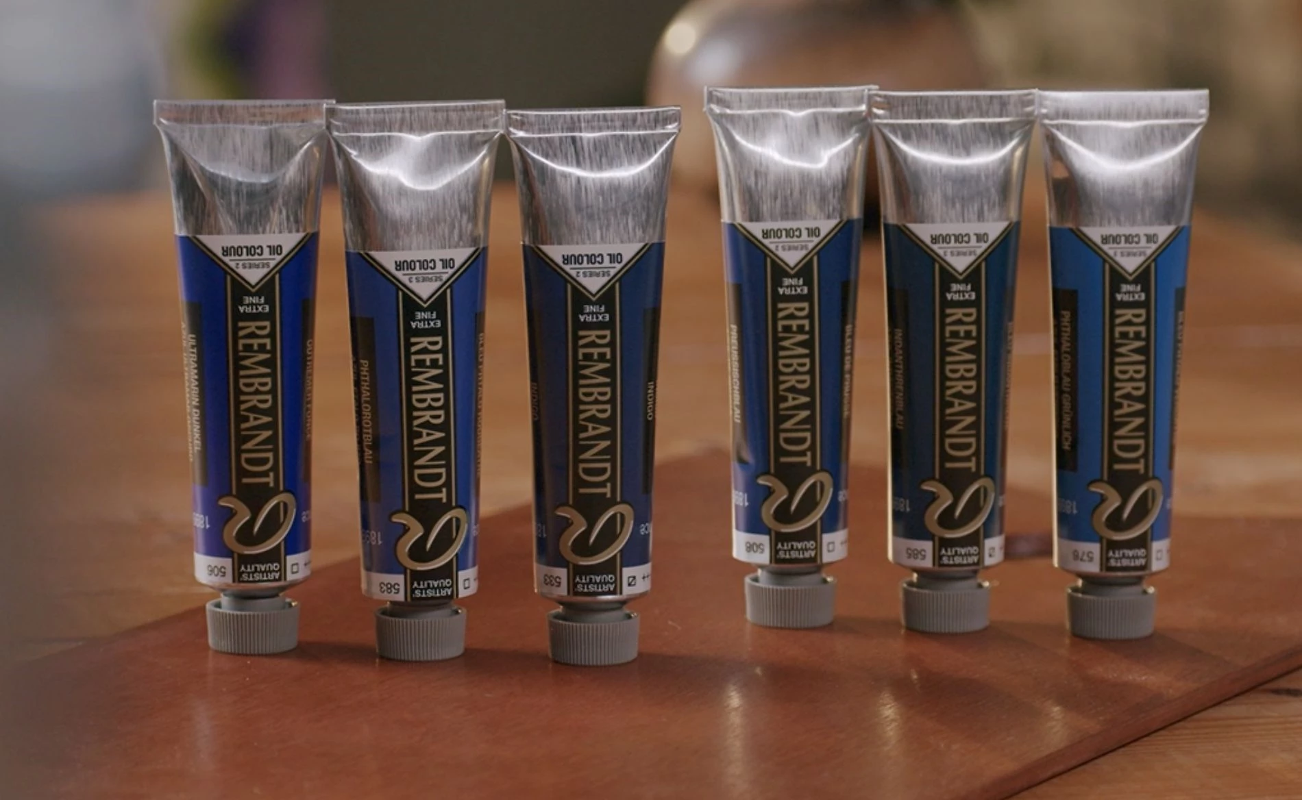
In the video below, we show you a selection of our beautiful blue shades. Since the actual colours can be difficult to judge straight from the tube, each shade is mixed with white to showcase its unique properties and undertones. This might help you select the right colours for your next artwork.
Transparency
Many blues in the Rembrandt collection are transparent or semi-transparent, which makes it difficult to judge the actual colour right away. Though the pigments themselves are transparent or semi-transparent, since they are so concentrated, they look much darker and more opaque.
If you spread a thin layer of a transparent shade onto a canvas, you are looking through far fewer of the pigments, so the light can pass through the paint and bounce back on the white canvas to your eye. This allows you to experience the blue shade in its true form.
To preserve these beautiful properties, we recommend mixing these shades with an equally transparent or semi-transparent colour. If you mix these transparent shades with a more opaque shade, both the transparency and brightness of the colour will be diminished. The opaque pigment will overpower the more transparent pigment.
Assortment
The Rembrandt oil paint collection features various bright blues in transparent and semi-transparent shades. To showcase their undertones while still protecting their unique characteristics, all shades were mixed with 103 Mixed White.
The following shades of blue were used in this video:
Other Oil Colour Blogs

Transparent Oxides
Oil Colour
Whites
Oil colour
Tonal Greys
Oil colour
Cadmiums and alternatives
Oil colour
Red shades
Oil colour
Blue shades
Oil colour
Green shades
Oil colour