Colour mixing theory
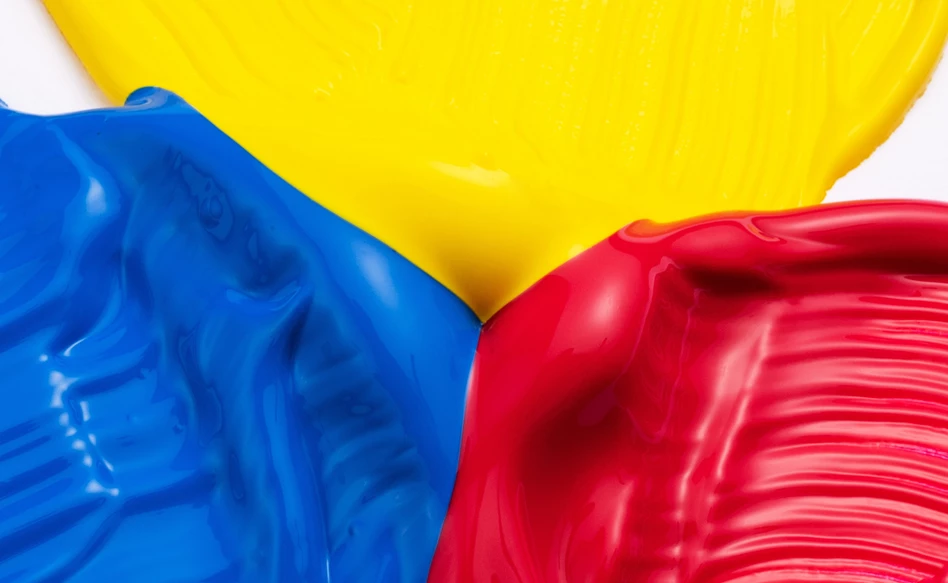
Primary colours (yellow, red and blue) are colours that you cannot create by mixing other colours with each other. Vincent van Gogh was convinced that these three basic colours are all you need to create any desired colour. With the primary colours and the shades black and white, you can create every shade you want to create your ideal colour palette.
Learn more about mixing colours in this blog or download our extensive colour mixing guide at the bottom of this page.
Mixing with 3 colours
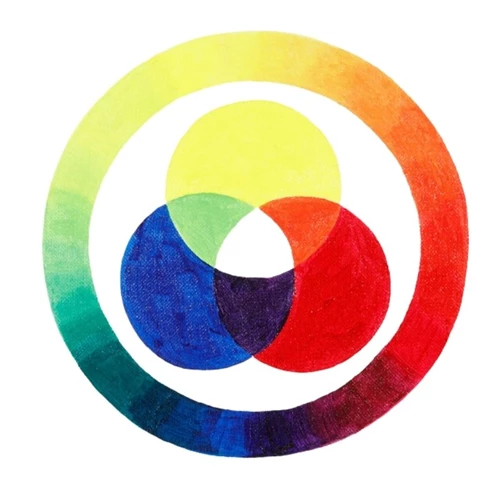
Using the three primary colours yellow, red and blue, you can create any desired colour. To start creating your own colour circle, start by mixing yellow with blue, blue with red and red with yellow. Mixing these colours creates new colours: green, violet and orange. Make sure to start experimenting with smaller amounts to prevent wasting the paint.
Secondary and tertiary colours
Orange, green and violet are called secondary colours. These secondary colours together contain all primary colours since you used those to create them. Whatever ratio you mix them in, their common primary colour will always decide the overall colour. A colour mixed using either two secondary colours or a primary and a secondary colour is called a tertiary colour.
Adjust the final colour by adding more of the primary colour of your choice. This way you can easily create a more yellowish orange or a more blueish green. Experiment with the amounts of the colours to create your desired shades.

How to create a colour circle
To create a circle with 6 colours, you can mix the colours that are adjacent to each other in the circle to create 6 new colours. By mixing the colours in the circle with each other, you can expand your colour circle to 12 and then 24 colours. When you’ve reached 24 colours, your colour circle should consist of various yellow, green, blue, purple and red shades. You can expand your colour circle practically infinitely by continuously mixing the colours together.
Mixing primary colours with black and white
As shown above, you can create countless colours using just the three primary colours. Using black and white, you can create various grey shades. Combining these two possibilities allows you to lighten or darken any colour.
Mixing all primary colours
When you mix the primary colours in the correct ratio, you can create a deep grey shade that is very close to black. This dark grey is dark enough to act as a black shade in your painting, but since this colour is made using colours, it will appear much more vibrant in your paintings than regular black paint.
Mixing with black and white
To brighten up or tone down your mixed colours, you can add black or white. White brightens the colour, while black tones it down. By mixing black and white together in different ratios, you can create a range of grey shades. These grey shades can also be used to mix with your primary, secondary or tertiary colours to help you extend your colour range even further.

Creating contrast using complementary colours
Colours across from each other in the colour circle are called complementary colours. These colours (blue and orange, green and red, purple and yellow) offer the strongest contrast. If you use these colours adjacent to each other, you can see that they strengthen each other. Vincent van Gogh often used these complementary colours to provide a sense of depth and excitement to his paintings. Contrast in colour is something that shows up in his work more and more over time.
Van Gogh’s typical use of colour also stems from practical reasons: simply to use up the paint he had laying around. Van Gogh was not only convinced the three basic primary colours were enough to create any desired shade, but also that you don’t always have to use the actual colour of an object in your paintings. This creates a much stronger atmosphere.

More information
Have fun painting! And remember, what is true for painting is also true for mixing colours: practice makes perfect. If you want to learn even more about colour mixing theory, click the button below to download our extensive colour mixing guide.
Watch the videos on the pages below to learn how to mix colours using either watercolour, acrylic or oil paint.


