Exploring limited palettes and glazing techniques with Ale Casanova

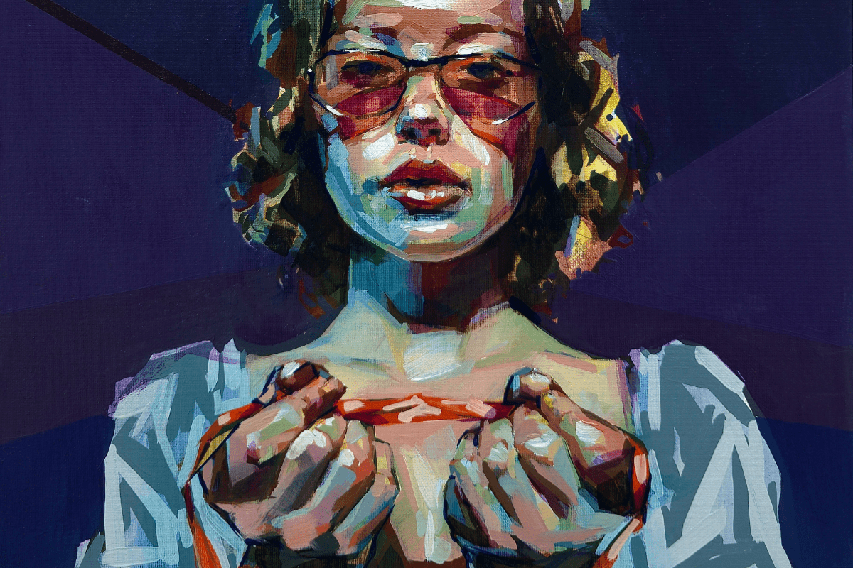
With that in mind, I accepted Talens’ challenge. They asked me to work with a very limited palette and then finish with glazes using surprise colours I would not know until the base was completed. This is not my usual way of painting, as I normally work directly, alla prima, but that was precisely why it was worth doing. Sometimes, to learn, you have to allow the painting to contradict you, pulling you away from comfortable gestures and reminding you that what matters is not control but looking more deeply.

Starting with a limited palette

To sustain the experiment, I relied on a method I developed at university and continue to use in my workshops: a chromatic grisaille in four ranges. Working from dark to light, I divide the painting into darks, dark midtones, light midtones and lights. Each range is considered in two temperatures, cool and warm, to keep the palette vibrant. I am not aiming for exact chromatic fidelity to the subject; I am building a structure of value and temperature to understand forms and create volume. This solid, flexible base allows me to take risks with glazes later.

The drawing comes first, and there are many ways to approach it: freehand, with a projector, transfer paper or a grid. I usually transfer it with graphite on the back of a photocopy, then press it onto the canvas. This marks the main limits, after which I finish the drawing freehand. Understanding forms is essential; a mechanical trace is useless if you do not know how to draw.

On top of the drawing, I apply a chromatic imprimatura: a very diluted wash of pure colour without white, almost like a veil. It does not darken the canvas but adds energy and softens the rigidity of the white. I apply it with a soft bristle flat brush loaded with turpentine, sweeping across the surface. Letting it dry slightly helps the following layers adhere better.

Building the foundation


The first wash of transparent, vivid colour tints the canvas and removes the white. From there, I begin the darks, preparing a warm reddish dark and a cooler greenish one. I apply them with a stiffer flat brush, allowing the brushstrokes to remain well defined. The paint needs to be fluid but opaque; I use Talens’ alkyd medium and adjust lightly with turpentine until it flows easily while still providing coverage. With these darks, I do not just mark shadows, but also redraw the forms, reinforce the composition and start to understand the subject in terms of volume.

Building the midtones

Next, I move to the dark midtones, choosing a warmer orange tone and a cooler bluish one. Using a softer flat brush, I intersperse strokes that shape the mid areas. I am not trying to replicate the exact colours of the subject, but rather to maintain the logic of value and the structure of light.

For the light midtones, I work with a warm pinkish tone and a cool greenish one, always mixing the three pigments to maintain a subdued harmony. The brush remains soft to ensure transitions are elastic and enveloping.

Applying the final lights

The lights come at the end, with a warm yellowish tone and a cool bluish one to illuminate the skin and surfaces. I switch to a harder brush, applying the paint denser and with more body. In a few very specific points, I introduce pure Titanium White, only in the brightest highlights. I avoid overusing white, preferring the sense of light to emerge from the relationship between values.

This process was completed in a single session of three to four hours. Thanks to the accelerated drying of the alkyd medium, I could start the geometric background framing the figure the next day. With the base finished, solid in volume and structure, the painting was ready for the true challenge: the surprise glazes.

Glazing the portrait

After waiting several days for the surface to dry, it was time to face the colours Talens had prepared: Permanent Violet Medium, Phthalo Turquoise Blue and Greenish Umber. Transparent and quite cool, they lacked a magenta or yellow to help balance flesh tones. I was nervous, but there was no choice but to jump in.

I do not usually work with glazes and was not used to Talens’ glazing medium, so I faced three challenges at once: unusual colours, a specific medium and the glazing technique itself. I relied on what I remembered from university: two soft brushes, one to apply and the other to move the paint, and a cotton rag. The medium, a mix of alkyd resins and refined linseed oils, is very transparent with quick initial drying, a long tack and a glossy finish.

The first glaze went on the canvas. The turquoise intensified bounce light areas, adding vibrancy. The violet reinforced shadows and contour lines. The greenish umber was applied in more defined, almost stabbing strokes to mark volumes and deepen the darks.

Applying the first adjustment layer

Despite keeping a low gloss in the alla prima base, many areas under the glaze darkened excessively. The glazing medium remains tacky for many days, so if you apply a new layer too soon, it drags and lifts, leaving a dirty, chipped effect. You need to wait until the surface is completely dry to the touch.

Once this adjustment layer had dried, I applied glazes again with the chosen colours. The violet helped reinforce shadows and sheen of the glasses, accentuating projected shadows on the skin, under-eyes, lips and areas of the neck. I also strengthened the darks of the ribbons on the hands and wrists with cleaner, more direct brushstrokes rather than blended ones.

Reflections on glazing, colour, and growth

I am already an old dog, and it is hard for me to face new dynamics. Leaving this well-known comfort zone is not always enjoyable, especially with so much other work to attend to. On the other hand, not taking the work too seriously and playing again without worrying too much about the outcome is a rewarding exercise that relaxes the atmosphere during repetitive studio days.

Working with glazes and Talens’ medium has been both a challenge and a complication. Accustomed to fast-drying alkyds, waiting a prudent time between phases is not something I am used to. But perhaps this pause leads to works less about immediate imprint and more about the process. Neither approach is better; they are simply different. The way things are done is not important for the viewer or collector; what matters is the result and the work itself.

See image: the final result, after the last glaze layer and adjustments with the initial palette.

Both the Phthalo Turquoise Blue and the Permanent Violet Medium will become part of the subsidiary colours in my palette. The blue is vibrant, clean and beautiful, and I plan to use it continuously. The use of glaze to intensify those blues in lit shadow areas will not be the first or last time I employ it.

Thanks to Rembrandt by Royal Talens for inviting me to keep learning and developing.

About Ale Casanova


Alejandro “Ale” Casanova is a Spanish painter and art teacher from Valencia, born in 1981. He studied Fine Arts at the Polytechnic University of Valencia and works with watercolour and oil, focusing on contemporary portraits and the human figure. Ale is also a long-time Rembrandt ambassador.

Read the full blog on Ale here.

Rembrandt oil paints

Rembrandt oil paints are made from the finest pigments, offering smooth consistency, rich colour, and excellent lightfastness.

Discover the full Rembrandt oil colour collection here.